React Course Selection App
- Final Demos
1. App Component Demos
description: Final Product Demos, including demos for each app component
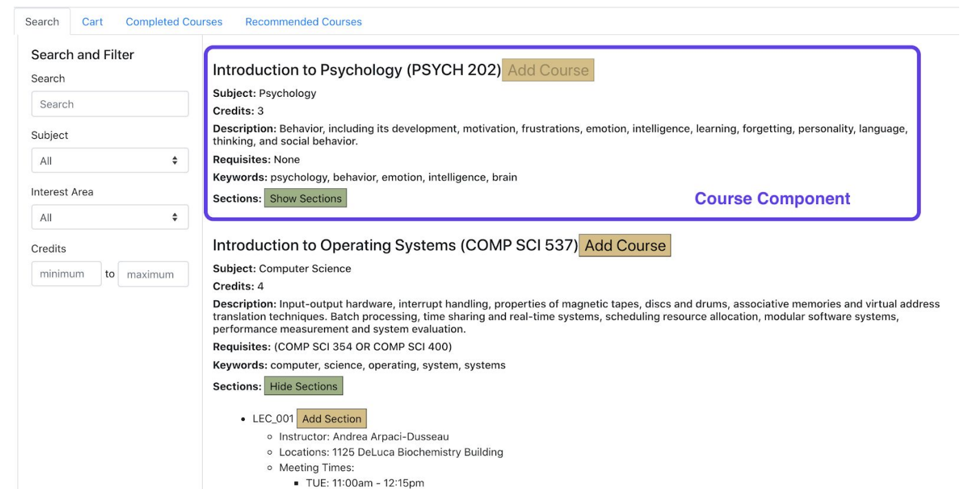
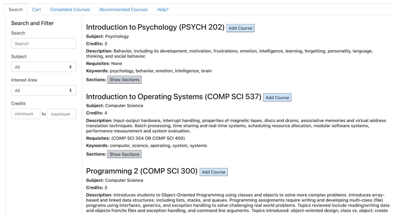
Component 1: This course component provides users with detailed course information, and allows users to see sections and subsections and add courses, which is critical for a course planner
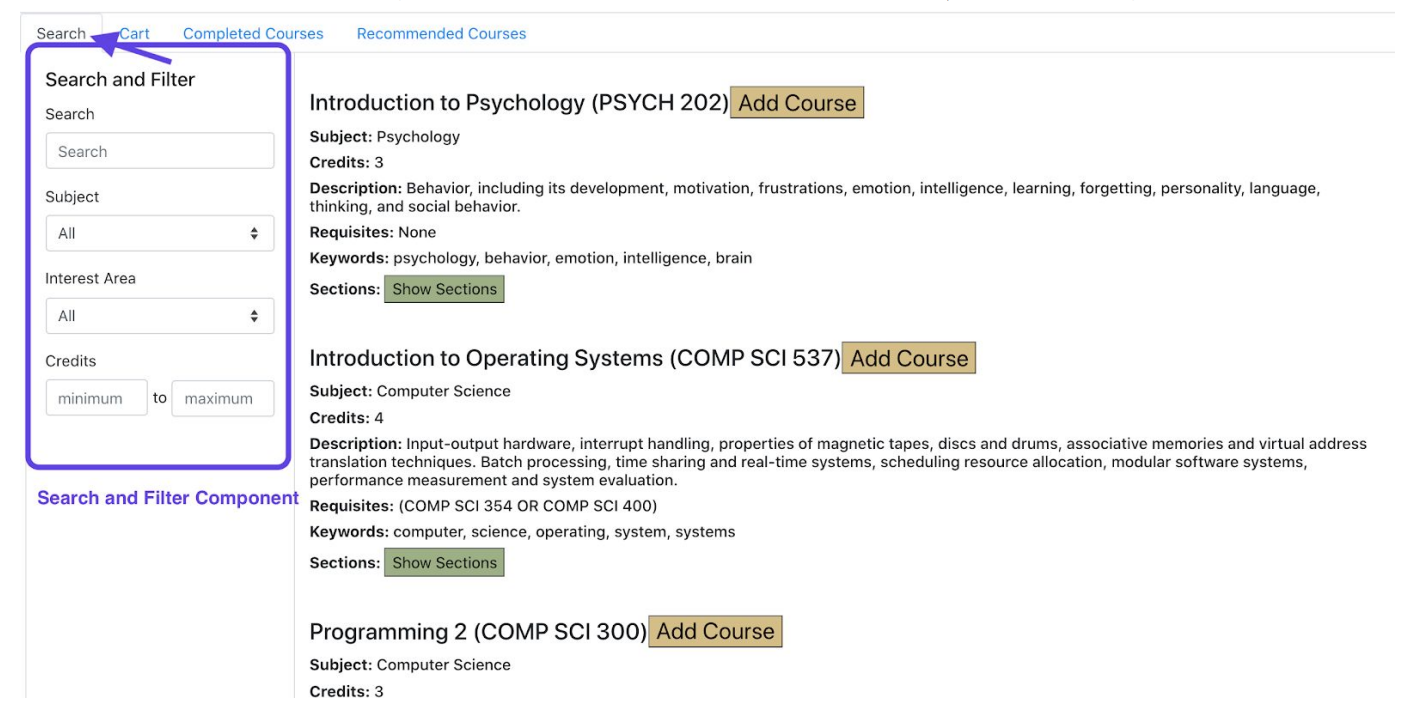
Component 2: The search component is critical because it helps users to filter out courses they are interested in from many courses. It narrows down the choices, which is very useful
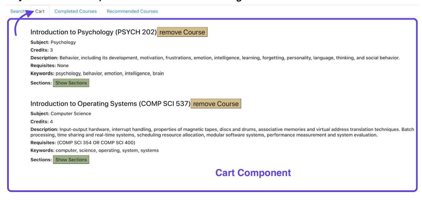
Component 3: The cart component is super critical because it allows users to see the courses they added to the cart, and it also allows users to change their minds and to remove courses
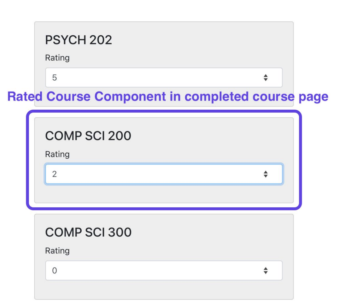
Component 4: The rated courses component allows users to rate their completed courses, and the ratings are used to decide what recommendations of future courses they are going to get. Thus, it is critical in this design
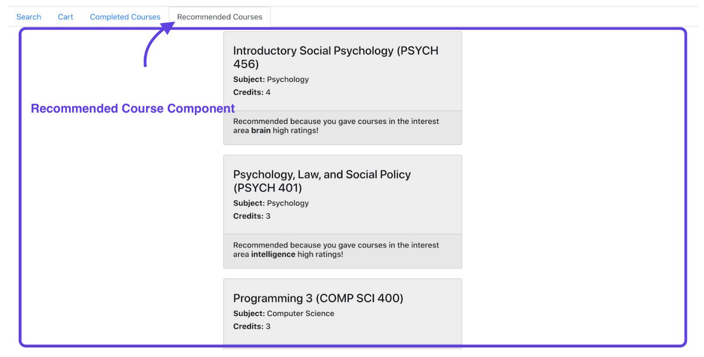
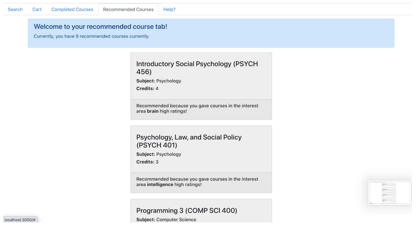
Component 5: This recommended course component gives users recommendations on courses selections based on their interests. It is critical for users to make decisions for future courses
2. Improved App Demos
description: Demos for additional functions added during the later stage of app implementation, including undo functions, alert functions, help page demonstrating frequently-asked questions, and updates on button sytles
10 Hueristic evaluation principles: 1. Visibility of system status 2. Match between real world and system 3. User control and freedom 4. Consistency and standards 5. Error prevention 6. Recognition rather than recall 7. Flexibility and efficiency of use 8. Aesthetic and minimialistic design 9. Help users with errors 10. Help and documentation
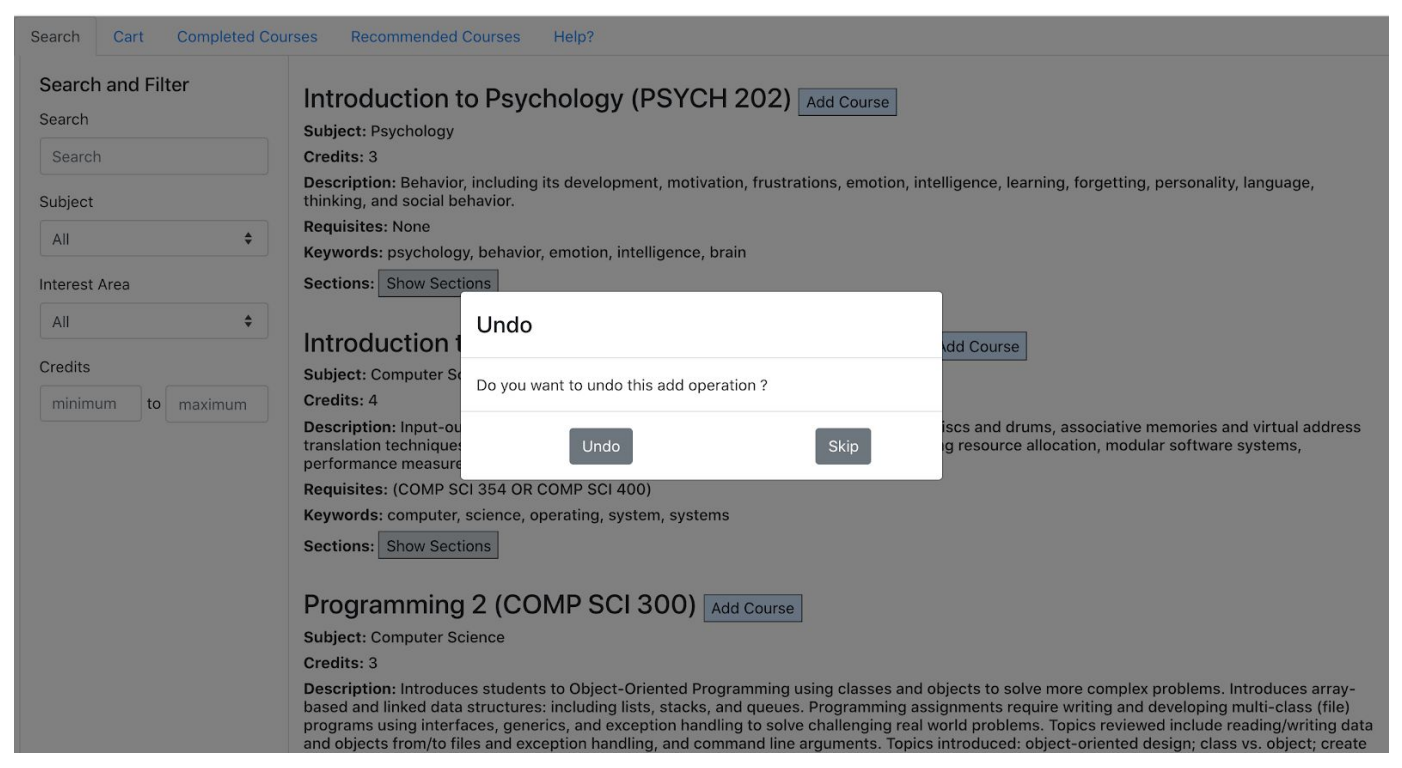
By following the heuristics in the project, I added undo function to my add course, add section, and add subsection, which allows users to change their decision if they made a mistake to add a wrong course.I also added an undo function to my remove course, remove section, and remove subsection, which allows users to change their decision if they accidentally removed a wrong course.
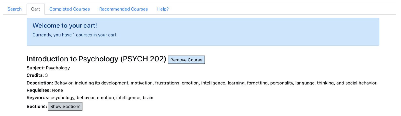
Besides, I added alerts to both the cart page and the recommended courses page so that users could know how many courses they currently added to the cart and how many recommended courses we currently provided with them.
Furthermore, I made the button “Show sections”, “Add Course”, and “Remove Course”, etc have the consistent text size, button size and consistent color to the system.
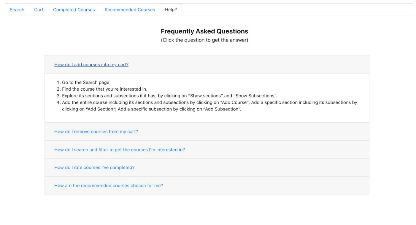
Finally, I added a Help tab, which provides 5 frequently asked questions, including how to add courses, how to remove courses, how to filter courses, how to rate courses, and how the recommended courses generated. I learned a lot from this project. The heuristics plays a big role.
By considering the 10 principles closely, I realized many usability problems in my program. Some have higher priority, such as the undo, and some have lower priority, such as allowing users to see the most recently searched course. Even though I didn’t optimize all of my violations, I just realized from the changes I made that the heuristics really helps me to recognize the usability problems and deal with them. It helps me to think more thoughtfully about what users need to know, what they want to know, what controls they would like to get, and how my program should be improved.
- Early Designs
Demos for some design ideas
1. Structure Design
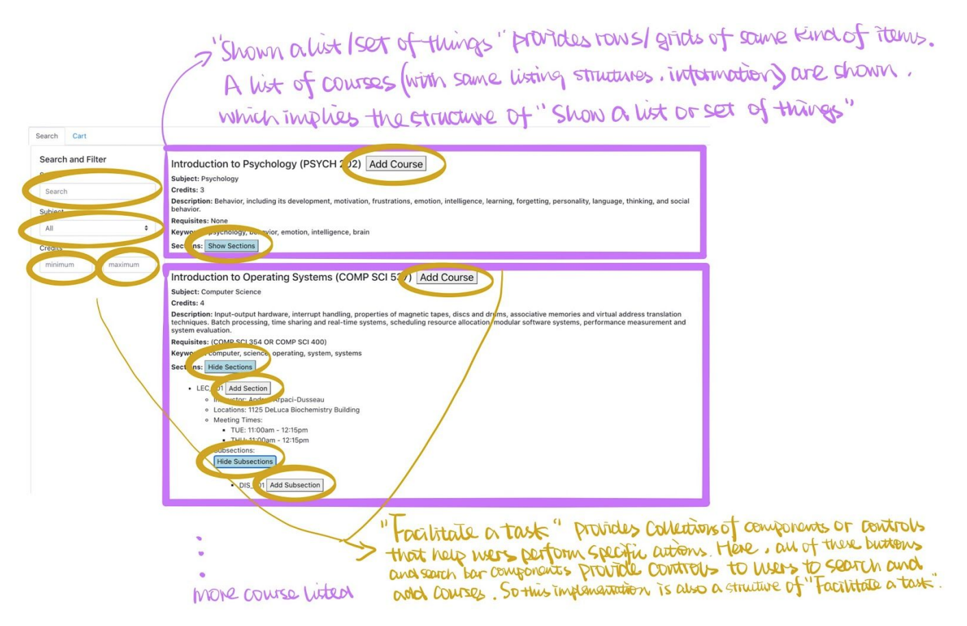
Description: The structure “Show a list or set of things” and the structure “Facilitate a task” are used in my app implementation. My implementation follows combine structures. The structure “Show a list or set of things” provides rows or grids of items of the same kind. It can be seen in the main page where all the courses including their sections and subsections are listed for users to choose. It also can be seen in the cart page, where all added courses are listed. The structure “Facilitate a task” provides collections of components or controls that help users perform specific actions. It can be shown by some action buttons in the main page, cart page, and the side search bar, such as “Add course”, “Add section”, search keywords and credits, “Show subsections”, etc. All of these provide users with controls to complete a task, which is managing their courses (including search, add, and remove).
2. Layout Design
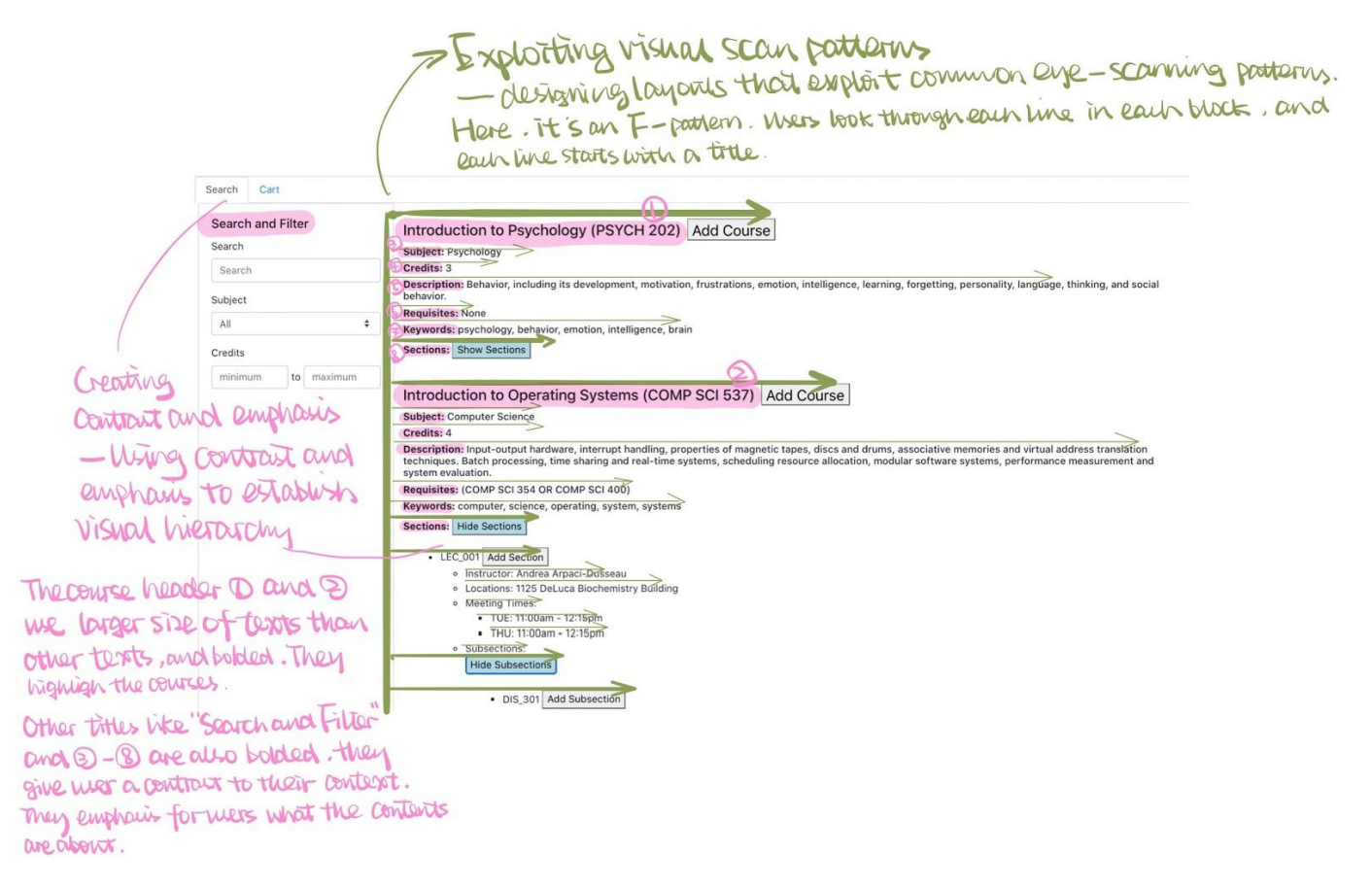
Description: The layouts of my implementation are Exploiting visual scan patterns and Creating contrast and emphasis.
3. Navigation Design
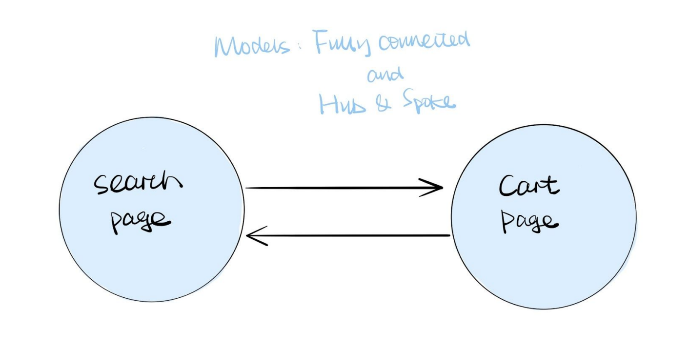
Part A: My app implementation uses a fully connected navigation model and a hub & spoke navigation model. It is a five-page application. It’s a fully connected model. For example, two pages (Search page and Cart page) are connected to each other, they can access each other. It is also a Hub model where we can see the Search page as the main page and other pages as specialized component pages. The central hub and specialized components can access each other.
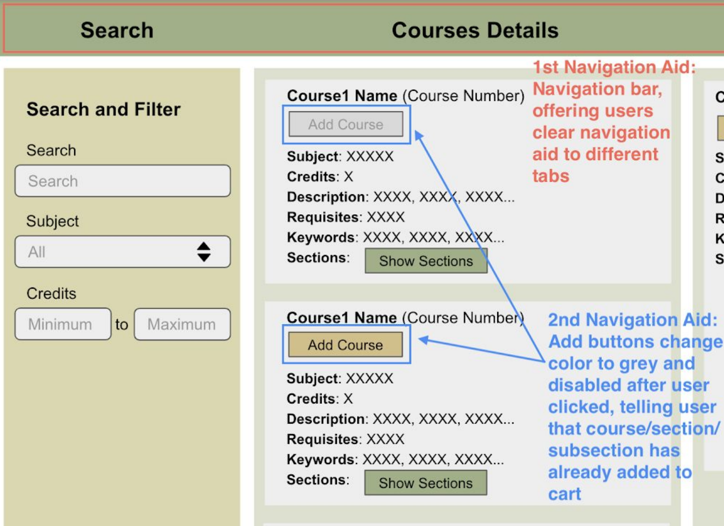
Part B: Navigation Aid Design